There are more than 2.2 million apps in Apple’s App Store, and nearly 3 million Android apps available through Google Play and others. Many will never have more than 1,000 downloads per year; fewer still will generate meaningful revenue for their publishers.
With that level of competition, all app marketers look for little advantages over the competition. Mastery of the fundamentals of App Store Optimization (ASO)—the de facto means for consumer discovery, downloading, and review of mobile apps—can provide just such an advantage.
What follows is a primer for app marketers and publishers on the mechanics of app stores, details on the fundamental differences between how Apple’s App Store and Google Play work, and some tips and tricks to give your app a competitive advantage on each.
How app stores work
Mobile users discover apps by searching for them, or being presented with them in the form of Top 5-type lists, which will be familiar to any smartphone or tablet user. In all cases, the relative ability of your app to be discovered via search or listing is determined by the individual app store’s proprietary algorithms. Google and Apple don’t publish these algorithms, but we do know many of the elements that are factored in by each:
- Popularity (downloads and frequency of use)
- Relevance (match to search terms, etc.)
- Peer reviews (number of reviews and rankings)
- Freshness (time since the app was launched and/or its latest version released)
Google, true to its strength as a search platform, approaches discovery by using semantic logic techniques to discern intent from a user’s search query. Apple’s approach, while similar, relies more definitively on specific keywords—in both cases, it’s clear that marketers must be very precise in the words that they use to describe their apps.
In the same way that copy and keywords are critical for being discovered, drawing a volume of positive user reviews is essential to climbing app store rankings and achieving virality.
To review an app on the Apple App Store, users have to be logged into their iTunes account. To leave a Google Play review, users must be logged into their Google account (e.g. Google+, where a user can quickly +1 the app). In both cases, this helps to avoid fraudulent reviews, but it’s a hardly a perfect system. It is easy and inexpensive to game the algorithms by buying reviews, either good ones for your app or bad ones for your competitor. But the app stores don’t like it and can remove your app entirely if they catch you. That risk of removal aside, fake reviews have a negative impact on user engagement and can be devastating to brand image when brought to light, as was the case with Apple’s exposure of Dash.
Updates to your app can help improve everything from rankings and downloads to user retention. Best practice is to release updates every 60 days or so. Do so more often and you may run afoul of the semantic and keyword algorithms; do so less often and you’re missing out on the only real testing capability you have in an app store (i.e. tweaking language, previews, screenshots etc.) Until recently, many iOS developers were reluctant to update because each new app version reset their review count, but that’s been addressed for iOS 11 and forward, with star ratings now reflecting aggregate lifetime reviews.
Design options and limitation of your app page
Both Apple and Google have rigid structures for your app’s page on their stores. Everyone gets the same spacing, format, character allocation, etc. Each user in a given region will have the exact same experience in your app (in other words, there’s no such thing as App Store personalization). These stark realities can be extremely limiting to marketers accustomed to more free-form approaches elsewhere on web and mobile. To make the most out of the opportunities of each app store, it’s important to understand the canvas you have to create upon:
For Apple, both your app name and its subtitle are limited to 30 characters—short and simple is better. You can have up to 3 videos of 30 seconds each, Use your promotional space to relate an update or media coverage. Select up to two categories. Keywords can total 100 characters. You’re allowed 5 screenshots; the first 2 are the most important). You can feature up to 20 items for in-app purchase.
For Google, your app name and subtitle are limited to 30 visible characters. Video(s) can be up to 2 minutes but must be hosted on YouTube. You can have up to 8 screenshots but can list under only 1 category, so picking the right one is critical. Google runs search off of your description so use words that describe your app early and often — at least 5 times total.
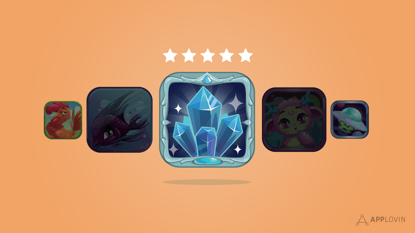
In both cases, your app’s icon is extremely important to success. Your icon will be the visual representation of your app across web, mobile and social, in-app and otherwise. It should be light, clear and contain no words (the visual area is just too small). It must be distinct and immediately recognizable. Fortunately, there are a number of good vendors and sources of information on how to get your app’s icon just right.
Of volume and volatility
App Store algorithms are very much self-nurtured beasts. Once an app has a volume of downloads, a plethora of good reviews, or a rapid increase in users, the algorithms sustain an app’s high ranking, thereby driving even more downloads. This is true even in the case of a popular app that has a less than satisfying version upgrade, which would normally be a death knell for a less-established app. Aurelie Guerrieri makes this point succinctly in her book, It’s an App World: The Mobile Native’s Guide to Marketing:
“Without the recurrence factor, an application that is very well placed in the ranking would almost be impossible to dethrone: a well-ranked application that attracts downloads by its visibility, continues to be ranked thanks to its volume of downloads, forming a virtuous cycle…the denominator remains large in the case of an application at the top of the ranking, which will therefore be less sensitive to volatility.”
In some cases, the algorithms attempt to combat this by disproportionately weighting the relevance of ‘freshness’ (see above) but the aggregate lifetime ratings approach ensures the impact of a single bad release remains minimal for the most popular apps.
A few words about getting featured, or other forms of ‘organic’ discovery
Having your app featured on an app store is like striking gold…the holy grail of app marketing. In addition to the ‘Top 5’ or ‘Most Popular’ lists, which are auto-generated, both Apple and Google have editorial teams that select a few lucky apps for coverage each week. Getting your app selected for this rare opportunity is the result of a) creating a great app that uses the latest bells and whistles of the respective platform, b) showcasing your app to the limits of the app store’s ability, and c) lots of luck, or having some great connections.
Of course, another way of getting visibility in an app store that’s not dependent on search is to get into the top charts. By timing your UA spend strategically, like Product Madness did with their Cashman Casino title, you can make yourself a prolonged home in the top charts.
Parting thoughts
Like pretty much everything modern apps marketers do, good App Store Optimization is about using a few simple tools and data points to create engaging experiences for mobile users. While the canvas app stores allow us to paint on are limited, the opportunities to perfect your technique and execute on your app’s unique brand vision are limitless.
