Over the past couple of years, simplistic and addictive mobile games began showing up and dominating the app stores. Noticing this trend, we dubbed these games “hyper-casual” and since then, the game genre has exploded and big players have taken notice. Zynga acquired hyper-casual specialist Gram Games for $250 million and Voodoo received a $200 million investment from Goldman Sachs to develop a publishing hub for mobile game developers.
But why do these games see such massive success? One reason is the use of minimalism in the game design. Minimalism, an art movement born in New York post World War II, is characterized by extreme simplicity of form. Hyper-casual games take inspiration from the minimalism movement to distill mobile games down to their raw elements. While many hyper-casual games may seem incomplete or even downright “lazy,” it’s actually by design.
By distilling mobile game mechanics down to the core, hyper-casual games explore what’s possible with game design, stripping away the superfluous.
The evolution of minimalism in gaming
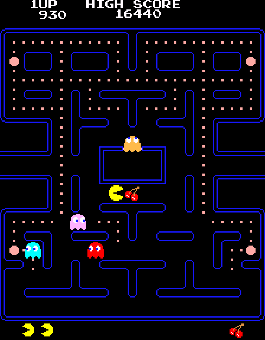
Minimalism is nothing new in gaming. Some of the earliest and most popular examples of the style are Pong and Pac-Man. Their concepts are simple and immediately clear, allowing anyone to pick up the joystick and know what to do. But for anyone who has ever played either game, there’s a certain level of skill required that keeps players coming back for more, striving to improve with each round.

But while the minimalism in classics like Pong and Pac-Man is appealing, the games were designed as such because of hardware limitations. Developers back then simply didn’t have the computing horsepower to develop the games we have today, and they had to create minimalistic experiences. Even though our smartphones now dwarf the power of early PCs and consoles, there has been a return to minimalism in game design as a challenge to create a game or to tell a story in the simplest way possible. It’s easy to add more elements to a game, but it’s more challenging to take elements away.
Mobile has long been a platform where game developers could experiment with minimalism. When the App Store first debuted 10 years ago, app developers quickly discovered that they had to play with certain constraints. Screens were small, players’ thumbs blocked their view of the game, and there were new control paradigms thanks to touch screens and accelerometers.

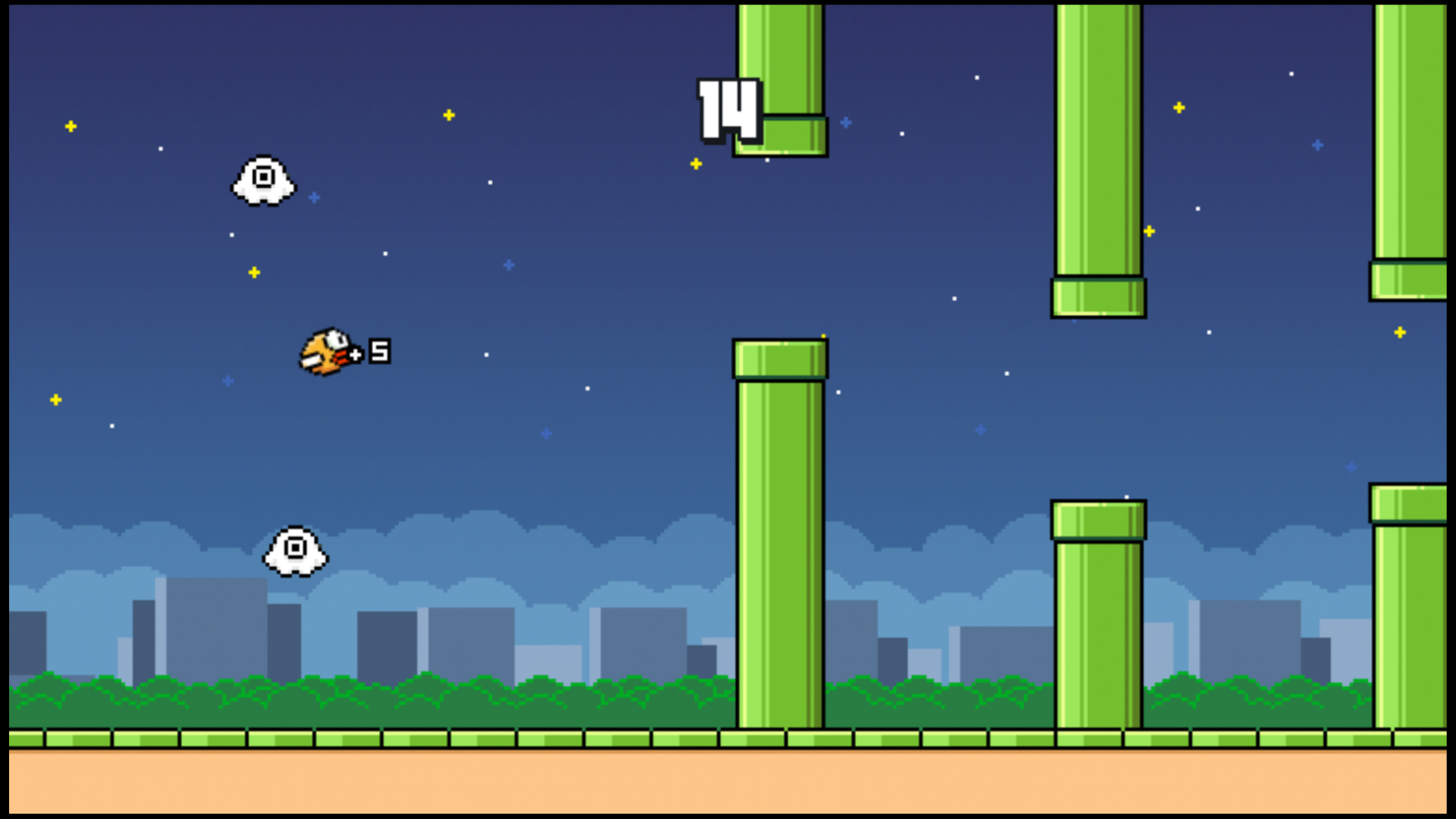
Flappy Bird showed the world hyper-casual’s potential.
Gradually, games became simpler and simpler. We went from full, console-like experiences with Crash Bandicoot Nitro Kart 2 to simple games like Tiny Wings. Then Flappy Bird came along and gave mobile game developers a taste of what was possible with an even more minimalistic approach to design. The viral sensation showed that simple mechanics could still result in an incredible challenge for players that kept them coming back for more.
It should be noted that the rise of simple games hasn’t displaced the love for more in-depth and complex experiences. We’re seeing a rise of full-featured mobile games like Fortnite and PUBG that lets players of the console and PC versions take the game on the go.
Minimalism in hyper-casual games
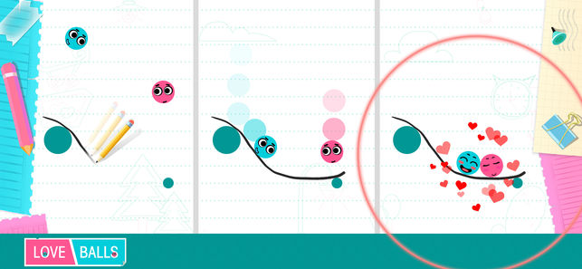
To explore minimalism in hyper-casual games, let’s take a look at Love Balls (Android | iOS), which is published by our media division, Lion Studios. The objective is to get a pair of anthropomorphized balls together by drawing lines with a limited amount of ink. The game doesn’t have a complicated onboarding process and players know exactly what the objective is in the first five seconds. Ultra Sharp has a similar simplicity, challenging players to get puzzle pieces to fall by cutting them in specific ways. Both feature minimalism in design but gameplay remains extremely challenging and addictive.

In games, minimalism can take the form of aesthetic, system, and even narrative design. Games can include just one or all three of these aspects. It’s typical to see hyper-casual games incorporate all three, because it forces the game to be a complete distillation of a core experience. Obviously, not all hyper-casual games require a narrative, like with puzzle games. However, Love Balls does show that you can have a minimalist narrative arc, which, in this case, is to reunite the two lovestruck balls.
In terms of minimalism in aesthetic design, hyper-casual games use very limited and deliberate color palettes with a lot of contrast, which helps developers convey mood, emotion, and personality. You’ll often find color palettes that pop to grab your attention in hyper-casual games. Hyper-casual games also integrate elements that are typically reserved for a heads-up display (HUD) into the environment itself. For example, instead of a persistent health bar, a hyper-casual game may turn elements red or flash the screen a certain color when damage is being taken.
Just like there have been numerous critics of minimalism in art, there are critics of minimalism in game design. Some may dismiss the hyper-casual game genre because of its simplicity but there’s actually a lot of thought that goes into creating a hyper-casual game. Instead of building out an onboarding process or creating a HUD, hyper-casual game developers must figure out ways to tell a narrative and explain core game mechanics in the most simple and natural way possible.
As the hyper-casual genre continues to mature, it’ll be interesting to see the types of experiences that mobile game developers will come up with next thanks to the constraints of minimalism.


